Pre-designed UI components based on the shadcn/ui library. This project is independent and not affiliated with Excalidraw or shadcn/ui.
Copyright © 2026 shadcndraw.com. All rights reserved.
Pre-designed UI components based on the shadcn/ui library. This project is independent and not affiliated with Excalidraw or shadcn/ui.
Copyright © 2026 shadcndraw.com. All rights reserved.
Most developers building a new app make the same mistake: they open Figma before they've validated anything.
It feels productive. You're "designing the product." You're picking fonts, setting up components, building out screens. Hours pass. Days, maybe. And you've got something that looks polished but you still haven't answered the only question that actually matters at this stage: does anyone want this?
There's a better path. And it starts with a whiteboard, not a design tool.
Let's be precise about the word, because it gets misused constantly.
Prototyping is not designing. It's not making something look good. It's mapping the user experience: the skeleton of your app before you put any skin on it. Where does the user land? What do they click? What happens next? How does the whole thing flow?
Think of it as blueprints. An architect doesn't show up to a job site with a finished interior design before the foundation is poured. They draw the structure first: the walls, the doors, the load-bearing elements. The paint comes later.

When you're building an app, prototyping is that blueprint phase. You're answering UX questions, not design questions. And that distinction matters more than most founders realize.
Figma is a great product. But it's a design tool, not a prototyping tool. And using it at the wrong stage is where most founders quietly waste weeks.
When you're just starting to flesh out an idea, your only job is to map the user experience. That's it. You shouldn't be thinking about colors, fonts, or component styles yet. But the moment you open Figma, that's exactly what it demands from you. Layers, typography, auto-layout, borders, spacing, design tokens. It's all right there, and it all competes for your attention.
That complexity is the problem. It clutters your mind at the exact moment you need clarity. Instead of asking "does this flow make sense for the user?" you're asking "should this button be 36px or 40px?" You've drifted from prototyping into designing without even realizing it.
Friction kills momentum. And Figma at the prototyping stage is nothing but friction.
Excalidraw is the antithesis of Figma in the best possible way.
It's simple. Intentionally. It looks like you sketched something on a napkin, and that's the point. When your prototype looks rough, your brain stops worrying about whether the button radius is right and starts focusing on whether the flow makes sense. The constraint forces the right kind of thinking.

There are no layers panel to manage. No type scales to set up. No color variables. You grab a rectangle, draw a box, label it "Dashboard," draw an arrow, label it "Click here," done. In ten minutes you have a complete user flow that you can walk through with anyone: a co-founder, a potential user, an investor.
That's the real power: speed combined with clarity. You can prototype an entire app in an afternoon. You can throw it away and start over by tomorrow morning. The low fidelity is not a weakness. It's the feature.
Here's where this really comes together for developers specifically.
If you're building with a component library (shadcn/ui, Radix, any of the major ones), your design is already mostly done. These libraries ship with beautiful, accessible, production-ready components. Buttons, inputs, modals, nav patterns, all of it. You're not reinventing the wheel.
So the actual workflow becomes:
Prototype in Excalidraw: map the UX, get the flow right, validate the idea
Build directly with shadcn/ui: drop in the components, wire up the logic
Skip the Figma phase entirely: because the components already look good
This is a legitimate shortcut. You go from idea → working product without the intermediate design phase. For indie hackers and small teams moving fast, this is enormous. You're not skipping design, you're borrowing design that already works so you can focus on what you actually need to prove.
Here's the harder truth behind all of this.
If your app hasn't achieved product-market fit, design doesn't matter. At all.
Founders routinely spend months perfecting the visual design of a product that turns out to have no market. Every hour spent on custom components, pixel-perfect spacing, and polished animation is an hour not spent learning whether users actually want what you're building.
The apps that win aren't always the best-designed ones. They're the ones that got to product-market fit faster than everyone else and then had the runway to invest in polish once they knew it was worth it.
That's the only rational sequence:
Phase 1: Prototype fast in Excalidraw. Validate the UX. Figure out if people want the thing.
Phase 2: Build it with a component library. Get it in front of real users.
Phase 3 (only if it's working): Now you invest in design. Hire a designer. Build a custom design system. Obsess over typography. Go deep.
Skipping ahead to Phase 3 when you're still in Phase 1 is how founders burn months on products that never find an audience.
Excalidraw has one legitimate weakness, and it's worth being honest about it.
Figma has a massive community. Thousands of free and premium UI kits, component libraries, and design systems built by designers worldwide. You can find a polished, pre-made component for almost anything in minutes and drop it straight into your mockup.
Excalidraw has none of that. Its community is small, and the available assets are sparse. So when you sit down to prototype, you're mostly drawing elements from scratch. That slows you down and creates inconsistency across your wireframes, which defeats part of the purpose.
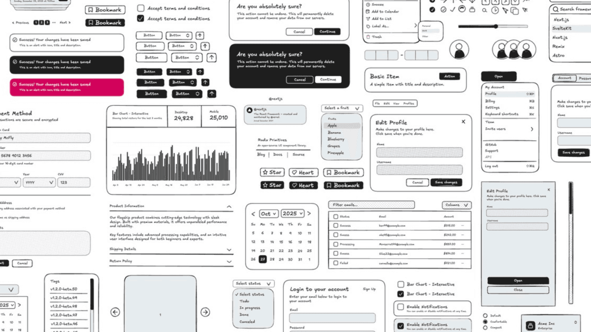
That's the gap Shadcn Draw was built to fill. It's a pre-made Excalidraw component library that mirrors the actual shadcn/ui component set, so you're prototyping with the exact components you're going to build with. No reinventing from scratch, no inconsistency, and no reason to open Figma.
Figma is a great tool. Use it when you've earned the right to care about design when you have real users, real traction, and a real reason to polish.
Until then, open Excalidraw. Sketch the flow. Build with shadcn/ui. Ship it. Talk to users. Iterate.
That's the whole playbook. The founders who move fastest aren't the ones with the best designs. They're the ones who stopped optimizing things that don't matter yet and stayed ruthlessly focused on the one thing that does: finding out if what they're building is something people actually want.
Shadcn Draw brings shadcn/ui components natively into Excalidraw, so your prototypes look exactly like what you're going to build. Check it out ->